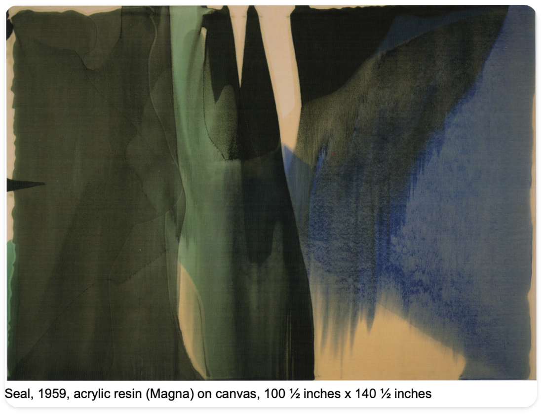
One of the first artists to inspire me with colour was Morris Louis, who created large abstract swathes of coloured canvases. He was part of the collective known as ‘Color Field Painters’.
The process of painting fascinates me and I love to see the ergonomics of the layering of paint. The subtle hues this creates, by layering, contrasted with saturated hues feel exciting.

Morris Louis, Pendulum, 1954, Acrylic resin (Magna), 79 x 105 inches
Morris’s paintings appear like a natural phenomenon, he creased channels into canvas and directly poured paint to flow onto the canvas. The softness of this layering feels much lighter than the work of other colour field painters like Mark Rothko.

Many of his paintings remind me of the veiled atmosphere of autumn light, under misty skies. How we apply the paint or image, not just the colour moves us. They are huge canvases in scale and have a very soft feel but the scale feels grand and impactful, leaving the viewer feeling enthralled with the painting.

Helen Frankenhaler is cited as a direct influence on Morris Louis, as they had a critical encounter in her studio, Helen encouraging him to push his work towards abstraction. Louis began “to feel, think and in terms of open colour”.
One of the most well-known female Color Field Painters, Helen Frankenhaler was an innovator, creating original and poetic paintings. She observed in 1983 “ Anything is possible.. It’s all about risks, deliberate risks.”


Frankenthaler draws on abstract memories of landscapes, making sweeping gestures, by pouring paint onto the canvas that behaves in unpredictable ways.
Another painter who embraced accidental happenings is Pat Steir. Her signature waterfall paintings, climbing a ladder to throw paint on the canvas and letting gravity create the artwork. They embody a sense of passing time, with cascading drips, the viewer is invited to a state of meditation.

More recently we see artists taking themes of colour into geometric forms. Etel Adnan's sensorial paintings are largely inspired by the natural world as well as her cultural experiences as a child with Lebanese roots.
Here colour is an elemental force, exploring culture, politics and landscapes.

Yayoi Kusama uses a simple form of the polka dot, to address themes of self-obliteration and obsession. She is well known for her ‘Infinity Rooms’ installations she has been producing since 1965. These take simple repetitive objects surrounded by mirrored walls to create an overwhelming experience. In terms of colour, this uses a restrictive palette for impact, alongside repeated patterns.

We can say so much with colour, it contains references to feeling, culture, history, trends, and memories. Everyone has their colour preferences too, which is personal to you.
If I ask someone to think of orange, they might picture terracotta or a bright zesty colour.
What colours are you drawn to?
And how do you use colour to express a feeling or mood?