There are some dos and don’ts when it comes to adding colour to your home. So if you’re feeling nervous about redecorating, or are seeking a big change but not sure where to start, this guide is intended to help walk you through the decision making process of picking colour, and how to finish a room.
If you prefer to take a tentative approach..
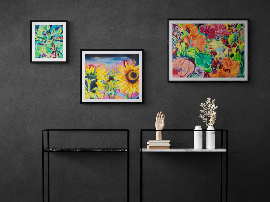
You can create a big impact with statement art, colourful accessories and furniture. You don’t necessarily need to completely revamp your home to inject some colour, or even paint your walls. Consider painting bookshelves, skirting boards and adding some new accessories.

Statement walls are a common way to create a block of colour or interest without committing to a full cover up of the walls. You can choose a colour or wallpaper as an accent to a room, it’s important the colour contrasts to the rest of the room to make it pop. Read up on the colour wheel below on tips to choose colours.
Remember, typically a room has 6 large surfaces that should be considered. 4 walls, your ceiling and flooring. How colour looks in a room is influenced by all the surfaces in your home. Another technique you may not have heard of is ceiling painting. Dark colours lower a ceiling, so be careful with this, whereas detail on the ceiling can uplift a room and make it look more spacious and interesting.

https://www.pinterest.co.uk/pin/128915608073938146/
Don’t forget how textures in your room change the feel, the flooring, rug, and also those reflective surfaces of mirrors and shiny textures. For ideas of how these elements work together, read on about doing your research.
Do your research..
Having a limited colour palette really helps focus the interior decor and giving yourself some constraints helps achieve a cohesive look. I suggest using 2-3 colours in a room, and if you like add an accent colour or some neutrals to that colour palette. I find looking on Pinterest an endless source of inspiration, just search colour palettes and you’ll get literally millions of results. Or you can go down the old fashioned route of flicking through a few magazines. Either way, do your research, find images of rooms you like and then, instead of simply copying them, adapt them to your style by taking the ideas and colours which work for you.

https://www.pinterest.co.uk/pin/44824958782428866/
Get to know the colour wheel
Pair colours opposite on the colour wheel for a vibrant colour palette. If you like bright and bold, the best way to achieve this is to match colours opposite on the colour wheel, and stick with the same type of colour palette. Whether that’s a saturated palette or pastel palette, consistency is key to create a sophisticated look.

Alternatively, choose colours on either side of your main colour and work within tones of that colour. I use pinterest for inspiring colour palettes that use both tones and accent colour to create a harmony that suits me. Creating a mood board is a good idea before redecorating, either old fashioned way of sticking images in a scrapbook or a digital one.

Every colour has a personality. What do you want to say?
What speaks to you?
You’ve got to live with it, it should be something you love.
This is so personal to the individual, different colours will have their own meaning to you, based on your memories and experience. Do you love blue or does it leave you feeling cold? Colours evoke different moods, and it’s most important you love the results in your home.
And finally
Have fun with it, worst case scenario you can repaint a wall, and believe me I have many times! Do your research, get inspired, and then make it your own.
As an artist I thrive experimenting with colour and love using bold and uplifting palettes. To see my artwork visit www.ruthegon.com
